
http://www.myspace.com/teardowntheflagship
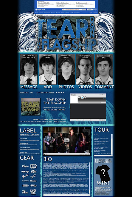
I'm really happy with how our final myspace has come out, we managed to get in the black and white to colour picture effects with our green screen photo shoot, which went rather well :)
I really like the blue theme we've got going and I'm particularly proud of the waves crashing down on the logo at the top of the page.
We managed to work in a viral marketing campaign, "Design our new t-shirt" as band merchandise is very big right now, with band logos across the chests of budding teens everywhere, so this idea gives them a sense of relationship between them and the band, while advertising the album, band, and brand image everywhere.
All in all I feel we managed to stick to the conventions of a website/myspace page, but make something that is enjoyable to browse :)
Monday, November 30, 2009
Thursday, November 19, 2009
Reflections on first draft of the Album Artwork
We designed our first idea for album art today, sticking with the themes of the myspace.
However Ms B says that she doesn't like how it seems to be all the same sort of artwork as on the myspace.
We'll have to have another look at our designs and see what we can do to change it, but still keep our brand image.
However Ms B says that she doesn't like how it seems to be all the same sort of artwork as on the myspace.
We'll have to have another look at our designs and see what we can do to change it, but still keep our brand image.
Monday, November 9, 2009
Reflections on first draft of Myspace
Myself and Ben came up with a first draft of our ideas for the myspace page today. We decided on a Nautical theme using lots of blues and also the waves from Simon's original album art design. We have decided to go against the standard myspace page using a DIV layout to go on top, thus making a webpage that looks how we want it to, rather than how myspace does.
A cool idea we found from http://www.myspace.com/considerthethief where the pictures turn to colour when you hover over them and are normally black and white. We liked the way the band members are shown right underneath the top banner and so we have put this into our concept.
We want to expand our page in width as we find the column of information on a standard myspace too thin.
Hopefully the actual myspace will come out how we designed it :)
Saturday, November 7, 2009
Reflections on the Edit so far
We've been editing for a little while and it looks like the video is finally coming together. It was all looking a bit pear shaped so we had a really intensive group meeting about our editing style and things have picked up from there.
I found a really good way of editing which was to find all the clips we needed for each section of the song, sync them up, and cut them all identically in layers to create what looked like a massive grid of shots. We then put on the "Show Frames" option on premiere and it was like having a giant storyboard of options for every cut. Its made the editing so quick as its really just a matter of which shot fits the couple of seconds the best.
So far we've done about half the song, having lots of problems with the intro but hopefully they'll be resolved soon.
The slow motion section Simon has done is phenomenal.
Subscribe to:
Posts (Atom)